Full Stack Development Articles
7 Best Practices to Secure MEAN Stack Applications
Popular React Native App Examples in 2024
How to Build a Developer Portfolio That Stands Out in 2024
What Is GraphQL? A Detailed Guide About The Intriguing Backend Framework [2024]

Get In Touch For Details! Request More Information

CSS Transitions: Important Things To Know About in 2024
Mar 23, 2024 6 Min Read 626 Views
(Last Updated)
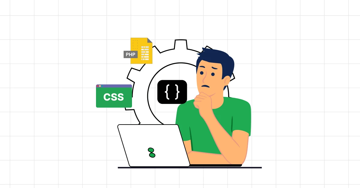
A website is boring if it doesn’t have any transitions in it. Why? Is it not enough to just create a website with minimal effort and just leave it like that? Sadly, it’s not that easy anymore.
With companies fighting to gain user’s attention, it is important to attract them with the first impression. To do so, you need to know about CSS transitions. This helps you to bring all your imagination to life and makes your website stand out.
If you don’t know a single thing about it, worry not. This article serves as your guide in learning all the things necessary for CSS transitions and by the end of it, you’ll be equipped with all the basic knowledge.
So, without any delay, let’s get started.
Table of contents
- What are CSS Transitions?
- Concepts of CSS Transitions That You Need To Know
- Property
- Duration
- Timing Function
- Delay
- Learn To Craft Your First CSS Transition: A Step-by-Step Tutorial
- Step 1: Choose Your Element
- Step 2: Define the Initial State
- Step 3: Sprinkle the Magic of Transitions
- Step 4: Specify the Change
- Full Code:
- Going Beyond the Basics: Learning the Next Step
- Experimenting with "Transform"
- Adding Multiple Transitions
- Creating a Sequence
- Example Code:
- Challenges and Considerations of CSS Transitions
- Performance Impacts
- Cross-Browser Compatibility
- Complexity and Maintainability
- Too Much of Nectar is Always Poison
- Tips for Overcoming These Challenges:
- Conclusion
- FAQs
- Can all CSS properties be transitioned?
- What's the difference between CSS transitions and animations?
- How can you ensure CSS transitions perform well across all devices?
- Can CSS transitions improve web accessibility?
- What's the best practice for using CSS transitions in web design?
What are CSS Transitions?
Whatever you do in real life, has some motion mixed with it. When you move your hand or walk from one place to another, every action has a smooth motion to it.
In the same way, imagine you’re flipping through a beautifully illustrated book. As you turn the page, the action isn’t instant, there’s a smooth motion as one page glides over to reveal the next. CSS transitions bring this graceful movement to the web, allowing elements on a screen to change states smoothly over time.
At its simplest, CSS transitions are a way to tell web elements, “Hey, don’t jump from one state to another abruptly. Take your time. Move elegantly.”
Whether it’s a button changing color when you hover over it, an image growing slightly larger, or a background fading into a different color, CSS transitions are the magic behind these moments of delight.
This may seem trivial or unimportant but once you start using it and seeing the result, these trivial elements add so much beauty and aesthetics to the website and that is why it is very important to learn CSS transitions to shine among others.
Learn More: Complete CSS Tutorial: Essential Guide to Understand CSS
Before we move to the next section, if you are not sure of your basics of full-stack development, enroll yourself in a professionally certified online Full-stack development course by a recognized institution that will strengthen your foundations.
Concepts of CSS Transitions That You Need To Know
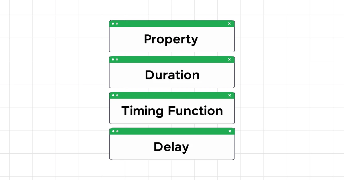
Let’s dive deeper into the world of CSS transitions. To fully grasp the beauty of CSS transitions, we must understand their key concepts: Property, Duration, Timing Function, and Delay.
1. Property
The property in a CSS transition refers to what aspect of the element will change. Imagine you have a digital photo frame that can change colors. If you decide to change the color of the frame from black to gold, the “color” of the frame is the property you’re altering.
transition-property: background-color;
This line of code tells the browser that the background color of the element is what we want to transition.
2. Duration
Duration is all about how long this change takes. If our digital frame takes 2 seconds to shift from black to gold, then the transition duration is 2 seconds. It’s like telling someone to take their time when walking from the door to the chair.
transition-duration: 2s;This specifies that the transition (or the color change) should occur over a period of 2 seconds.
Also Explore: A Complete Guide to HTML and CSS for Beginners

3. Timing Function
The timing function is a bit like the pacing of a story. Does the change start slowly and then suddenly complete quickly? Or does it happen at a steady pace throughout? This function allows you to control the acceleration and deceleration of the transition.
transition-timing-function: ease-in-out;'ease-in-out' is one of the most common timing functions, where the transition starts slowly, speeds up, and then slows down again towards the end, making it smooth and natural.
4. Delay
Sometimes, you want the transition to wait a bit before starting, like pausing for effect in a conversation. This waiting period before the transition begins is the delay.
transition-delay: 1s;With a 1-second delay, when you hover over or click on an element (depending on your setup), the change doesn’t start immediately but waits for 1 second.
You will get to see all this in action towards the end of the article.
Read More: Best Techniques for Creating Seamless Animations with CSS and JavaScript
Learn To Craft Your First CSS Transition: A Step-by-Step Tutorial
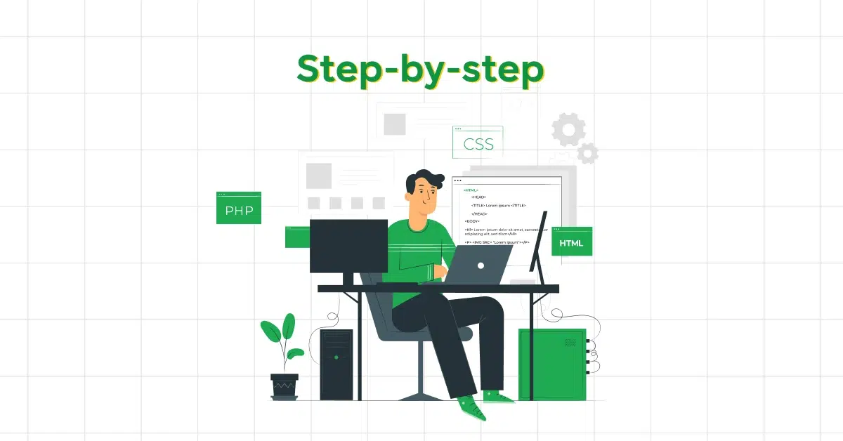
Immediately diving into CSS transitions might seem daunting at first, but let’s break it down into simple, easy steps to make it easy for you.
It’s time for you to craft your first CSS transition:
Step 1: Choose Your Element
First things first, decide which element on your webpage you want to animate. It could be anything – a button, an image, or even a text block.
For our first transition, let’s go with a classic example: changing the background color of a button when the user hovers over it.
Step 2: Define the Initial State
Before we make it interactive, let’s set a starting point. This is how your button looks before any interaction. Add some basic styles to your button. Here’s a simple CSS for a blue button:
button {
  background-color: blue;
  color: white;
  padding: 10px 20px;
  border: none;
  cursor: pointer;
}
Also Find Out: Functions in JavaScript: Important Things To Know [2024]
Step 3: Sprinkle the Magic of Transitions
Now, let’s introduce our transition. We want the background color to change smoothly when someone hovers over the button.
To do this, we use the 'transition' property. This property needs a few details: what you’re animating (the background color), how long the transition should take (let’s say 0.5 seconds), and the timing function (how the transition will progress, e.g., ease-in-out for a smooth start and end).
Add the following line to your button’s CSS:
transition: background-color 0.5s ease-in-out;Step 4: Specify the Change
Now that your button knows it should animate the background color smoothly over half a second, we need to tell it what to change to.
This is where the ':hover' pseudo-class comes in, allowing us to define a new background color when the mouse is over the button.
Add this CSS:
button:hover { background-color: red; }Must Read: Variables and Data Types in JavaScript: A Complete Guide
Full Code:
Combining all the steps, here’s what your CSS should look like:
button {
  background-color: blue;
  color: white;
  padding: 10px 20px;
  border: none;
  cursor: pointer;
  transition: background-color 0.5s ease-in-out;
}

button:hover {
  background-color: red;
}
Output:
Before Hovering:

After Hovering:

And there you have it! When you hover over the button, it will now smoothly transition from blue to red over 0.5 seconds, thanks to the magic of CSS transitions.
Remember, the key to mastering CSS transitions lies in practice and experimentation. You can use practice platforms like GUVI’s WebKata, an innovative way to learn CSS through various practice tests making your learning fun and interesting.
Explore: A Comprehensive Guide to HTML and CSS Roadmap [2024]
Going Beyond the Basics: Learning the Next Step
Now that you’ve dipped your toes into the world of CSS transitions with your first smooth background color change, you’re probably wondering, “What’s next?” Let’s elevate your skills by venturing beyond the basics.
CSS transitions are not just about fading colors; they’re a gateway to creating more complex and visually appealing interactions.
So, let’s get started.
Experimenting with “Transform”
One of the most powerful properties you can animate with CSS transitions is 'transform‘. This property allows you to rotate, scale, translate (move), and skew elements, offering a playground for creativity.
Scale an Element:
Let’s make an image grow a bit when someone hovers over it. Here’s how you can achieve that:
img {
  transition: transform 0.3s ease-in-out;
  transform: scale(1); /* Default state */
}

img:hover {
  transform: scale(1.1); /* On hover, scale up by 10% */
}
In this example, the 'transform' property smoothly increases the image size by 10% upon hover and returns to its original size when the mouse moves away.
Adding Multiple Transitions
Why stop at one? You can combine multiple properties of CSS transitions in a single transition. Let’s say you want an element to not only grow but also change color smoothly.
.element {
  background-color: blue;
  transition: transform 0.3s ease-in-out, background-color 0.3s ease-in-out;
  transform: scale(1);
}

.element:hover {
  transform: scale(1.1);
  background-color: red;
}
Here, both the 'transform' and 'background-color' properties transition at the same time, creating a more complex and visually interesting effect.
Also Explore: All About Loops in JavaScript: A Comprehensive Guide
Creating a Sequence
Sometimes, you might want different transitions to occur in sequence rather than simultaneously. This can be achieved by using transition delays.
For example, you could make an element first change color and then move:
.sequence-element {
  transition: background-color 0.3s, transform 0.3s 0.3s; /* Note the delay on transform */
  transform: translateX(0); /* Starts from its original position */
}

.sequence-element:hover {
  background-color: red;
  transform: translateX(100px); /* Moves 100px to the right */
}
With the 0.3s delay on the transform transition, the element first changes color, and then, after a brief pause, moves to the right.
Also Read: Complete Guide to this Keyword in JavaScript [2024]
Example Code:
Combining all the things that you saw in this section, here’s a sample code to help you understand this better:
Index.html [HTML file]
<!DOCTYPE html>
<html lang="en">
<head>
    <meta charset="UTF-8">
    <meta name="viewport" content="width=device-width, initial-scale=1.0">
    <title>Advanced CSS Transitions Example</title>
    <link rel="stylesheet" href="style.css">
</head>
<body>

<div class="card-container">
    <div class="card">
        <h2>Interactive Card</h2>
        <p>Hover over me to see a cool effect!</p>
    </div>
</div>

</body>
</html>
Style.css [CSS file]
body {
    display: flex;
    justify-content: center;
    align-items: center;
    height: 100vh;
    margin: 0;
    font-family: Arial, sans-serif;
    background-color: #f0f0f0;
}

.card-container {
    perspective: 1000px; /* Adds perspective to the container */
}

.card {
    background-color: white;
    padding: 20px;
    border-radius: 10px;
    box-shadow: 0 4px 6px rgba(0, 0, 0, 0.1);
    transition: transform 0.5s ease;
    transform: rotateY(0deg) scale(1); /* Initial state */
    cursor: pointer;
}

.card:hover {
    transform: rotateY(20deg) scale(1.1); /* Rotates and scales the card on hover */
}

h2 {
    margin-top: 0;
}

p {
    color: #555;
}
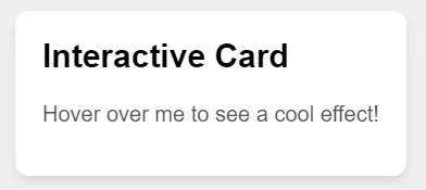
Output:
Before Hovering:
After Hovering:
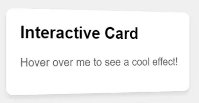
How it Works:
- The
'.card'class initially has a straightforward appearance but is set up for a transformation with the'transition'property targeting the'transform'attribute. - On hover,
'.card:hover'triggers the transformation, combining a slight'rotateY'(rotation around the Y-axis) with a'scale'for an engaging visual effect. - The
'perspective'property on the'.card-container'ensures that the 3D rotation effect of the card has depth and looks more realistic.
This example demonstrates how to utilize CSS transitions to create more complex and visually appealing effects, going beyond basic opacity or color changes.
Explore More: Top 11 CSS Frameworks for Front-End Developers: A Comprehensive Guide
Challenges and Considerations of CSS Transitions

Creating a seamless experience isn’t always a walk in the park. There are a few hurdles and considerations to keep in mind as you dive deeper into the world of smooth CSS transition.
Understanding these challenges will not only improve your skills but also ensure your website remains performant and accessible.
1. Performance Impacts
Not all CSS properties are created equal, especially when it comes to animations. Some properties, like transform and opacity, are optimized for transitions and can be animated smoothly without causing a hiccup in your website’s performance.
However, animating properties like width, height, or margin can be more taxing on the browser. This is because they require the browser to recalculate elements’ positions and geometries, potentially leading to sluggish animations and a less-than-stellar user experience.
Also Know About Types of CSS: A Comprehensive Guide to Styling Web Pages
2. Cross-Browser Compatibility
Not all browsers interpret CSS transitions in the same way. While modern browsers generally support transitions well, there can be inconsistencies in how animations are rendered, especially in older or less common browsers.
Testing across multiple browsers ensures your CSS transitions deliver a consistent experience for all users.
3. Complexity and Maintainability
As you start to implement more complex animations, the code can quickly become difficult to manage. A transition that changes multiple properties at various stages, or one that triggers other animations on completion, can become hard to read and maintain.
It’s crucial to keep your animations as simple as possible and consider using CSS animation libraries or JavaScript if things get too complex for pure CSS.
4. Too Much of Nectar is Always Poison
Animations can be problematic for some users, especially those with vestibular disorders or motion sensitivity.
Excessive or unnecessary movements can cause discomfort or even physical reactions in some individuals.
It’s important to use transitions sparingly and wisely, provide options to reduce motion if your site relies heavily on animations, and ensure that your website’s core functionalities are accessible with or without animations.
Must Explore: HTML vs CSS: Critical Differences Developers Can’t Ignore
Tips for Overcoming These Challenges:
- Optimize for Performance: Stick to animating properties like
opacityandtransformwhenever possible. - Test Extensively: Use tools and resources to check your website’s performance and compatibility across different browsers and devices.
- Keep It Simple: Complex animations can be split into smaller, more manageable pieces or handled with JavaScript libraries designed specifically for complex animations.
- Be Mindful of Users: Implement a prefers-reduced-motion query to respect users’ system settings that reduce or eliminate animations.
While CSS transitions can significantly enhance the user experience, they come with their own set of challenges.
By understanding these potential pitfalls and planning accordingly, you can create smooth, accessible, and enjoyable web experiences for everyone.
Also Read: 10 Best HTML and CSS Project Ideas for Beginners
Kickstart your full-stack development journey by enrolling in GUVI’s certified Full-stack development course that not only teaches you the basics but also gives you practical experience through real-life full-stack development projects
Conclusion
In conclusion, CSS transitions are a powerful tool for full-stack developers, capable of significantly enhancing the user experience when used correctly.
By understanding their workings and adhering to best practices, you can craft smooth web experiences by incorporating CSS transitions that are not only visually appealing but also intuitive and responsive.
Keep experimenting, but always keep your users’ needs at the forefront of your design decisions. Remember, the goal is to complement the user’s journey on your site, not complicate it.
Also Read: Top 20 HTML & CSS Interview Questions With Answers
FAQs
1. Can all CSS properties be transitioned?
No, not all properties can be transitioned. Properties like color, opacity, and transform are commonly transitioned, whereas layout properties such as display cannot be animated through transitions.
2. What’s the difference between CSS transitions and animations?
CSS transitions are meant for simple interactions involving a start and end state, while CSS animations are more complex, allowing for multiple keyframes and states throughout the animation.
3. How can you ensure CSS transitions perform well across all devices?
Focus on animating properties that are GPU-accelerated, like opacity and transform, and avoid expensive properties that trigger layout changes or repaints.
4. Can CSS transitions improve web accessibility?
Yes, when used thoughtfully, CSS transitions can guide users’ focus, but excessive motion can be problematic for some users. Implementing prefers-reduced-motion queries can enhance accessibility.
5. What’s the best practice for using CSS transitions in web design?
Use transitions sparingly for subtle effects, prioritize performance by animating properties that don’t cause reflows, and ensure your design remains functional without them.
Career transition


Did you enjoy this article?